miércoles, agosto 30, 2023
|
There are many properties to add content, but which one is the best to use depends on the layout of you content.
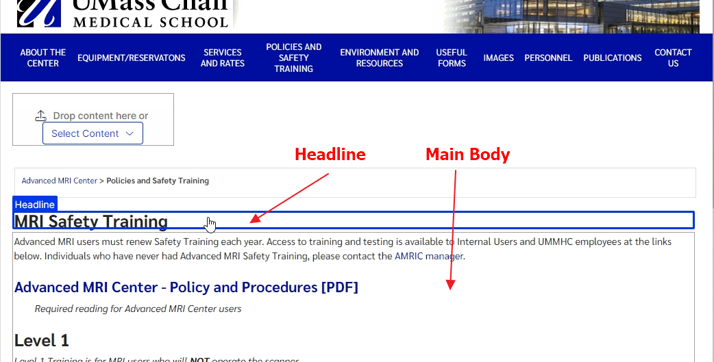
For many pages, content can be added in "display view" by updating the headline and Main Body properties:

Where it gets complicated is when there is some content you want to display full width of the browser, or introduce color backgrounds, or display multiple blocks to create a symmetrical or assymetrical grid.
When to use a block or the WYSIWYG area for simple content
Content can be easily added to the WYSIWYG area of any page. However, there are times you may want to have the same content on multiple pages, ie contact information. In that case, it is best to create a generic block and add the contact information. This block can now be dropped on multiple pages. Then, when the content needs to be updated, update the block and all the pages with that block show the updated content.
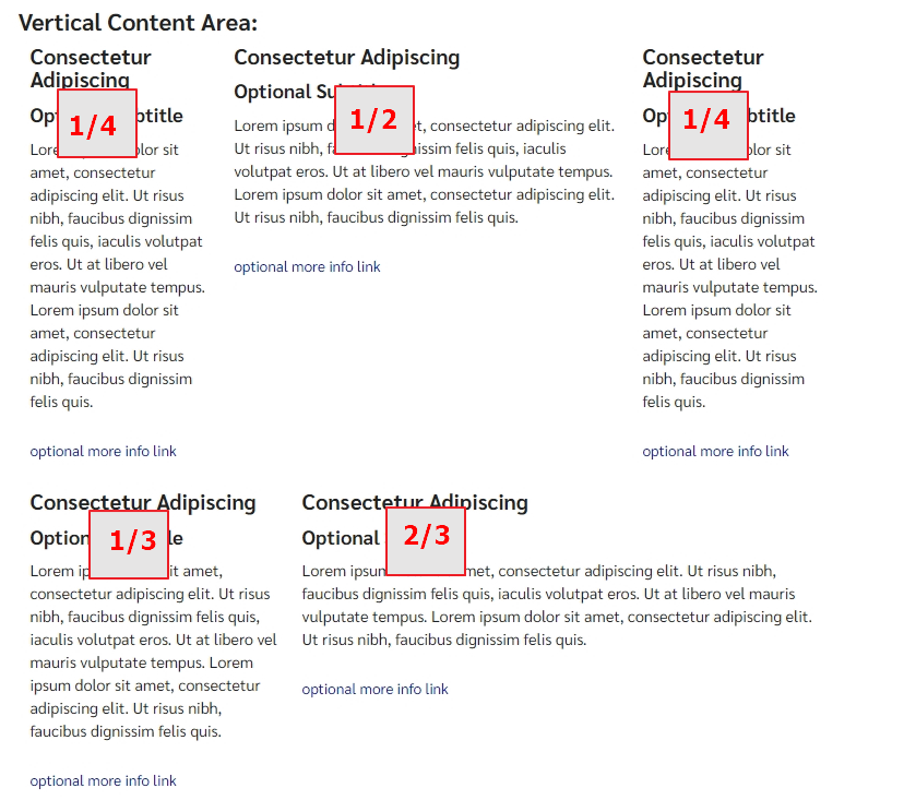
The other reason you may want to use a block for simple content is to display small snippets of content like a 3 column format. In that case, you could create 3 generic blocks of content added to a drop block area and set each block to "display as" to the width you desire.

Other times, the decision to use a block is simple as you may want to provide certain functionality like: listing staff or faculty pages, or listing a bunch of links within a grid in a button format with the link list block, or applying background colors with the horizontal full width block or grid layout block.
Choosing which drop block area to add content
When editing in "All properties" view, you will see many tabs and properties where you add blocks. But which drop block area to use?
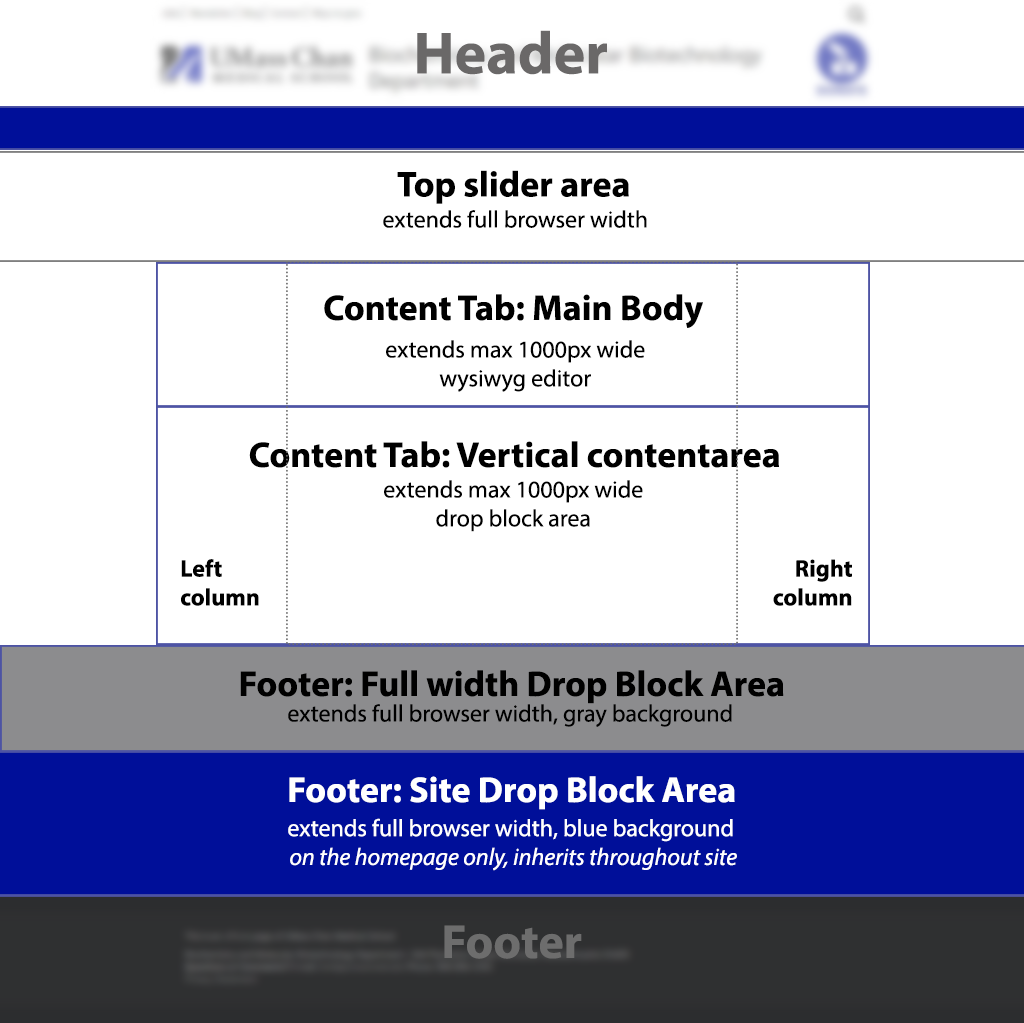
The image below depicts where the different content areas reside on the template to help you decide where to add your block:

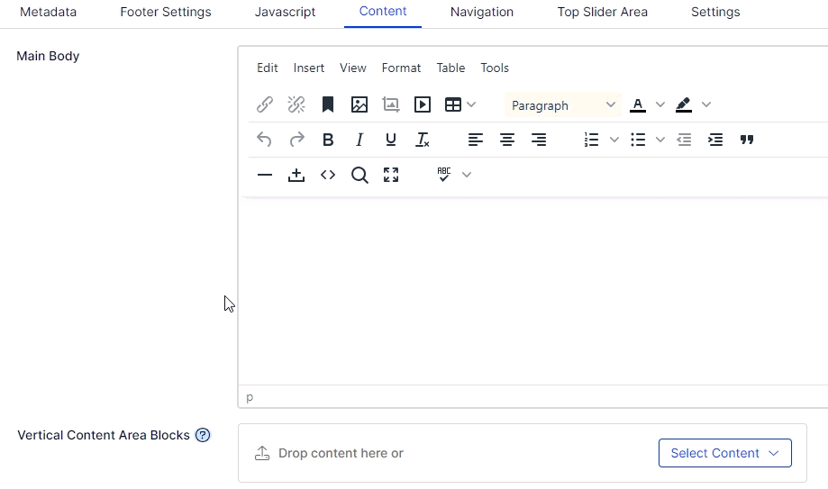
First, change from "Display View" to "All Properties" view so you can now see all the properties of the page you are editing.
[user guide: properties view]
Top slider area Tab: "Top Full-width Area"

Display location: under the main menu and above all other content areas.
When to use: allows blocks to take up the full width of the browser and above all other content (displays above breadcrumb trail, left/right columns and all other content areas)
Examples:
Content Tab: "Vertical content area"

Display location: under any content you may have placed in the Main Body (WYSIWYG editor)
When to use: allows for multiple blocks which you can set to any width to create a symmetrical or assymetrical layout of rows and columns.
Example:
Note: Horizontal content area set to be decommissioned, please do not use. This area was created before we had the ability to set widths on blocks. It was created to allow us to set columns of blocks, but we now use the vertical content area for that.
Footer Tab: "Full width drop block area above footer"

Display location: under the Main Body and Vertical content area, and above the footer.
When to use: blocks extend full width of the browser.
- displays a gray background, typically used to be set apart from content and closely associated with the footer.
- using the horizontal full width block, you can select a different background color if you wish to override the default gray this area provides.
Exmaple:
Footer Tab: "Site Drop Block Area - inherits throughout site"
Microsite Landing page only (homepage)
Display location: between the "Full width drop block area above footer" and the footer itself.
When to use: when you wish to display blocks to all sub pages of this site, this area inherits down throughout the entire site.
- displays a blue background with white text, typically used to be set apart from content and closely associated with the footer as well display on every page in the site
- using the horizontal full width block, you can select a different background color if you wish to override the default blue this area provides as well as change the default text color.
Exmaple:
