Link List Block
miércoles, febrero 15, 2023
|
The link list block can be use to display a list of links that can be formatted as a bulleted list, a standard list, as a dropdown or a group of buttons. The block can also be reused on multiple pages allowing you to edit 1 block and the updates will display on all pages that contain that block.
This block ensures that list if formatted properly and that it is ADA compliant.
Examples >
Create a new block
In a dropblock area on your page, or under your folder in the block pane, create a new block
[user guide: create a new block]
Video Tutorial
- Choose Link List Block
- Add a "Name" and click the create button
- If you created the block directly on the page, you are brought back to you page, click the "..." on your new block to edit it

Properties on the page
[user guide: properties view]
On the Content tab
- Title [optional] will display as an H3 at the top of the block
- Description [optional] - add a short summary above the links
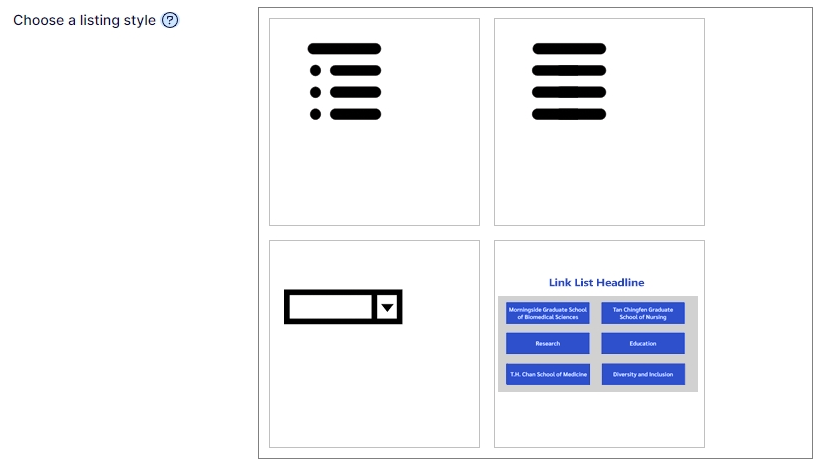
- Choose a listing style - select how you wish the list to display:
- bulleted list
- standard list
- as a dropdown of links
- as a group of buttons
- List of Links - here you can drag and drop content pages from the content tree (left pane) or add links to external sites. These links can be dragged and dropped to change their order.
Types of links you can create:
- links to other pages in the CMS
- media assets (files stored within the CMS like PDFs, Word, or images)
- email
- external link (page on another web site)
- If Choose a listing style is set to:
- Dropdown, a field for "Dropdown Selection Title" will display. This allows to change "Select One" that initially display on the dropdown.

Display as Buttons
example: https://www.umassmed.edu/zzz/example-site/example-pages/listing-blocks/link-list-block/

Block properties:
- Choose a listing style:
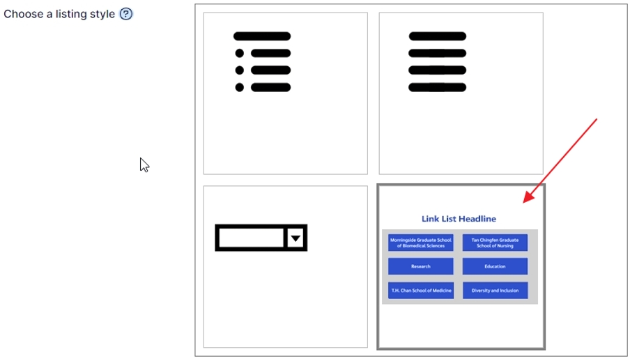 Upon selecting the button style, 2 tabs appear:
- Layout & colors
- Button color – set the color of the buttons
example: UMass Chan colors
-
- Block Headline Text Color sets the color of the headline that will display above the button area
- Text Size allows you to set the headline and button text larger (3 options)
- Button Area background

- Grid Layout
-
-
- Column Minimum width, set the smallest width you wish the buttons to be
- Column spacing style - set the width/gap between the columns
- Row spacing style - set the width/gap between the rows


 Upon selecting the button style, 2 tabs appear:
